Robin Wilson has a long road ahead of her.
She is the new marketing director of Quadz Inc., an all-woman-led cannabis dispensary company with ambitious plans to expand across Canada, adding to five locations currently in development in Alberta.
Sitting in Wilson’s coworking office space in downtown Toronto, she describes the journey ahead for Quadz.
She is working on rebranding the company and figuring out exactly how the stores will operate.
But Wilson admits a lot is still up in the air for Quadz.
Since dispensaries are a fairly new retail concept, no clear path exists for which direction is best to head in — they are not a liquor store, and certainly not a pharmacy, either.
This means brands are taking the concept in different directions and doing a lot of experimentation to see what works.
Wilson has her eye on the trends, though, and tells me the best practices that are beginning to emerge.
Apple Store Inspiration
In the prohibition days, the standard model of dispensaries was a counter with a budtender standing behind it to take your order.
Now, you might notice a different experience walking into a legal dispensary. Gone is the overbearing counter, replaced with more of an open concept similar to other retail experiences, such as an Apple Store.
I took a visit to Tokyo Smoke’s flagship dispensary location in downtown Toronto recently, and immediately noticed the drastic change.
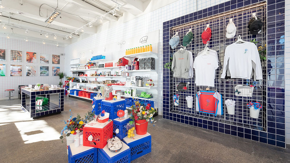
The store is essentially a giant room that has samples of bud lined on walls inside of “smell jars” to get a whiff of the product, along with some upscale accessories displayed, such as designer bongs and quartz pipes.
After entering the dispensary, I was quickly welcomed by an iPad-carrying staff member who asked what I was looking for and if I had any questions. He looked up the CBD oil I had in mind on his iPad, and with a touch of a button it was ready for pickup at the checkout.
Megan Stone, who has been designing dispensaries for more than seven years with her consultancy, High Road Studios, says open-concept designs are gaining steam because they represent “more shoppable” options.
“It allows you to self-explore,” she said. “That tends to be how people prefer to shop.”
Not only does this setup allow more carefree shopping, Stone says it can also make operations more efficient because it eliminates the presence of cannabis on the sales floor that staff have to fumble around with lockers to access.
Instead, the order is fulfilled back-of-house and is quickly prepared for pick up at the cash register, which frees floor staff to engage more with customers.
Wilson says Quadz is leaning towards the open concept model precisely due to these efficiency reasons.
“[The open concept makes it] easier to control product,” she said.
A Branding Exercise
In an industry filled with advertising regulations, companies are beginning to realize that dispensaries are a great way to impact consumers and tell their brand stories.
Since dispensaries can act as a branding exercise in their own right, Stone always asks clients what their brand identity is beforehand when designing their dispensary.
“[The brand] informs a lot of the store’s aesthetic look, as well as its space planning, merchandising layout and its program,” she said.
To help distinguish themselves from competitors, some brands are turning to bold concepts or themes for their shops.
One such brand is Superette, a dispensary chain that currently has one store in Ottawa and one in downtown Toronto.
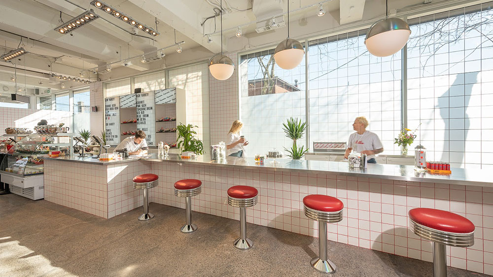
Superette’s look is based around retro convenience stores and neighbourhood bodegas, co-founder Drummond Munro tells me. The name Superette is actually a synonym for a neighbourhood convenience store.
Munro says Superette’s nostalgic design concept helps the stores feel “innately familiar” to many customers, which is especially important given newcomers may be intimidated by what is a newly-legalized drug.
Superette creates this unique vibe with a lot of successfully-deployed small touches, such as a deli-style counter, shopping baskets and retro diner subway tiles.


Munro wanted to take his dispensaries in a different direction than some of the Apple Store clones that have opened, so it would feel more down-to-earth and could appeal to a wider range of shoppers.
“We’re trying to create an environment where it feels like it’s part of [your] community,” he said. “It feels like the convenience store down the road that’s run by the owner who knows your name every day.”
Wilson agrees that a concept or theme can be helpful for a dispensary’s brand and can create buzz for the shops.
“You’re still talking about [the dispensary afterward],” she said. “They’re creating an Instagrammable moment.”
Education First
Wilson hopes that Quadz will be fully embedded in the communities where its stores are located, but for this to happen, she says that they first need to create an inviting atmosphere to help customers feel comfortable.
Wilson says education is a big way to ease newcomers into the pot experience — she’s not the only one who thinks this.
Walk into any legal dispensary and you’re likely to see some form of educational materials on its walls providing a quick cannabis 101. I certainly noticed some explanatory pamphlets in the Tokyo Smoke location I visited.
Hobo Cannabis Company is one dispensary brand that is taking education seriously in their eight stores across Canada by offering several ways for customers to self-educate, along with budtenders who know their stuff, too.
Hobo’s brand vice president, Harrison Stoke, describes a “decision tree” that is included in Hobo stores that splits their inventory up into five categories ranging from high energy to low energy highs, which customers can navigate like a “volume slider.”
Hobo will also be incorporating a “Terpene Bar” into some of its stores, Stoker says, to help familiarize customers with the chemicals that give cannabis much of its flavour and smell. The bars will feature essential oils that contain some of cannabis’ many terpenes, which guests can sample.
Stoker says that dispensaries often have a wide variety of customers walk through their doors, each with their own level of knowledge about the plant, so it is important to provide ways for customers to choose how much education they receive.
“Every degree of education should be available to a consumer who wants it,” he said. “[We] let them choose their own adventure, if you will.”
Kinks
Since dispensaries are a fairly new kind of retail experience, there are still some kinks that companies are trying to figure out.
Stone points out smell jars, which hold small cannabis samples for checking out a strain’s odour, as a “growing pain point” for retailers.
“It’s very hard [for me] to look at a single bud that is in a smell jar that is most often dry, crusted over and doesn’t represent the product you’re going to walk out with,” she said. “I don’t know how much that’s actually helping the shopping experience.”
Stoker for one definitely isn’t happy with the waste of product that happens due to laws that dictate that whatever is in those smell jars has to be destroyed each day.
“There’s no way to mitigate the cost,” he said. “So it’s a pretty heavy line item, when you’re replacing your entire range of dried flower, you know, every sort of six to 10 days.”
But how do you let customers sample cannabis before purchasing?
Stoker says Hobo is considering using more digital media options to inform customers about strains, such as instructional YouTube videos.
Cannabis brand Irisa has gone further and has offered virtual reality (VR) experiences at some Canadian dispensaries to help customers get a sense of strain effects with visuals, sounds and even scented oils.
Another challenge for dispensaries is working within regulations that can dictate some aspects of how the stores operate.
For example, Canadian law says customers can’t have a direct view of a dispensary’s show floor immediately when they walk in, which has caused most retailers to erect a big wall at the entrance.
But some companies are finding ways to make the regulations work for them, such as making the barrier a “statement wall” that can feature the brand’s logo, Wilson says.
Hobo decided on a different approach — to give up sales space to create a lounge-style area in that entrance walkway.
“It’s worked out really tremendously well because people do really enjoy that first kick of comfort to ease them into the browsing experience,” Stoker said. “It is creativity through constraints.”
The Future Looks Diverse
One thing is for certain: dispensaries will continue to evolve as the cannabis industry matures.
How they will look years from now can be difficult to peg down, but Stoker has his money on dispensaries specializing.
This means we could one day see them acting more like boutique shops that focus on a specific product category, such as edibles or CBD tinctures, rather than offer everything in one place. A bakery with a twist, anyone?
That’s not to mention consumption lounges that are now opening, allowing visitors to enjoy their purchases on-site.
“[Cannabis] is an emerging market,” Stoker said. “[Besides the obvious policies], there are no rules on how you need to build it.”


