Cannabis has a new look.
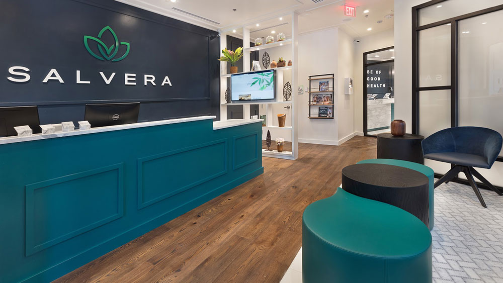
In Los Angeles, California, I step into a MedMen dispensary and am hit with rays of white light emanating from its clean, Apple Store-like kiosks.
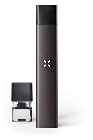
Back at home, I pick up a Pax cannabis vaporizer and can’t help ogling at its sleek industrial design, smooth aluminum finish and soft green glow from its iconic X light while I casually sip back some vapour.
Gone are the tye-dye shirts, the dank basements, and dirty bongs. Now it’s about clean, minimalist design and open, light-filled spaces.
Greencamp spoke to top players elevating cannabis’ design to understand why the green is getting a new look. Let’s dive in.
Cannabis design takes the High Road
Megan Stone began High Road Studios seven years ago in Arizona as a cannabis dispensary design agency with a mission to “reinvent society’s perceptions of cannabis and its users,” she said.
Stone noticed that there was a huge disconnect between the industry’s narrative that cannabis was now safe and could be used medicinally, and shops that looked like “illegal, dangerous places.”
“Nobody wants to go into a place that feels like a criminal outpost to receive something that is supposedly medicine,” she said. “Designing these spaces to feel more safe, more inviting, more comfortable, more shoppable is very important to the growth of the industry.”
Stone wanted to add design-thinking to the spaces — meaning using design to solve practical problems — as well as use natural materials like wood, and layer colours, textures and lighting to create a warm and inviting atmosphere.
Since beginning High Road, she has designed over 60 dispensaries across the U.S., perfecting a more sophisticated user experience.
She says that the lobby room is often seen by the public from the outside, so it is important that it “sets the tone” for an “elevated experience.”
“[The lobby] is a beacon and billboard of what this industry can be to the public and the non-patient citizens that might see it,” she said. “It is a huge opportunity to rebrand the experience.”
Taking into consideration the psychology of a first-time customer who might be intimidated by the new experience, she makes sure the lobby space is clean, secure and professional.
She encourages dispensaries to shed the glass walls around receptionists that have shrouded them in the past in order for them to take more of a restaurant host role rather than a security guard.

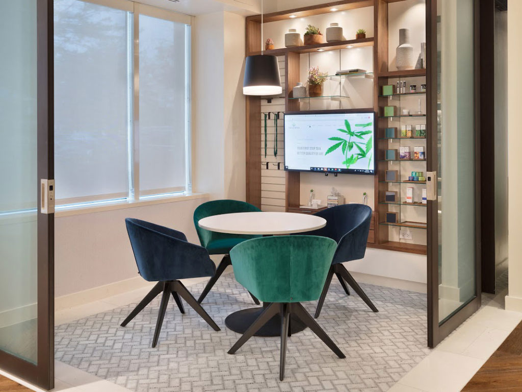
Next, Stone takes me through her design philosophy for the consultation rooms that are often required in medical spaces so patients can speak to a physician and get educated about the drug.
She uses glass walls and places them next to the dispensary’s showroom so patients can get a glimpse of the next step in their cannabis journey.

Moving on to the actual showroom, she steers away from budtender counters or the deli-style approach because she feels it is “outdated” and “not the best use of the space conducive to the best shopping experience.”
Stone says many of her projects use a more open retail concept with enclosed displays since many markets limit the ability to put live products on the floor for display. She’ll include dedicated edibles areas or concentrate bars to entice customers.
A branding tool
Design can come in handy for brands who want to distinguish themselves in an industry where advertising restrictions run rampant, Stone explains.
She says a brand could use pictures of the dispensary in their flyers or brochures, or can create a memorable experience that can stick in shoppers’ minds — like going to an Apple Store.
The nice thing about cannabis is its versatility in how it can be dressed up. Stone says there’s no single look that lends itself to the plant, such as the color green or the material wood, but brands can go in many different directions.
For example, a modern and hip brand might have a very different look than one that is outdoors focussed.
“Our job is to be storytellers,” says Stone. “It is to design spaces that fully envelop you in the brand experience that the brand wants to have.”
Trends
However, some design trends are creating a more homogenous look among cannabis companies.
Jennifer Culpepper, the founder of Annapolis-based cannabis design agency Brand Joint, says that one big trend for design and packaging is the minimalist look — lots of whites and clean lines.
Culpepper explains that the minimalist design is actually the second wave of cannabis looks to come about since states’ legalization.
The first was more of an apothecary design — think old fashioned 19th-century remedy shop — since people were beginning to see cannabis as a medicine, but not as a traditional pharmaceutical medicine.
Now companies are turning to a minimalist look in large part because of regulations that restrict the brand elements you can have on a package, such as anything that may appeal to children.
The problem, though, is that when all products begin to use similar designs, it limits brands’ ability to differentiate themselves, Culpepper says.
“If your products are similar, and now your packaging design is similar, what makes customers choose your product versus the one sitting next to it?” she asked. “If there’s nothing else to differentiate, they may then go to price.”
To counter this, Culpepper tries to steer companies to adopt new trends early, before they become diluted.
For example, Culpepper says one new trend is using design in smart ways to educate the customer and aid their cannabis experience. She says Brand Joint designed a system to tell concentrate cartridges apart from each other by colour coding the packages based on their respective strain.
She also recommends companies think about their customers’ psychographics when designing products and spaces, rather than just the demographics. This means the design should be linked to users’ interests and passions, such as an outdoors lifestyle, rather than just their age or where they live.
The power of design — a Pax case study
There’s one brand that has mastered mixing lifestyle with design — Pax Labs, makers of the Pax vaporizer.
The first Pax vaporizer took the cannabis industry by storm in 2013 with its industrial design that has been likened to Apple products. Some called it the “iPod of vaporizers.”
With the Pax vaporizer on its third iteration, the company recently launched a concentrates vape in Canada, called the Pax Era.
Tim Pellerin, the general manager of Pax Canada and International, says that the Pax was invented as a more discreet and approachable way for cannabis users to consume the plant outside of rolling a joint, which could cause frustration to some.
From this mission came the design-focused Pax vaporizer that sparked a lifestyle, which the company labels with #paxlife, based on its easy and convenient use.
Pellerin says that Pax’s design definitely helped it fit seamlessly into people’s lives and also steer cannabis use away from its old stigmas related to bongs and joints. Cannabis has a clean slate, being as approachable to someone working on Wall Street as to a hip bartender.
“What we’ve seen is good design has really welcomed new consumers by offering a product that feels right for them — and never makes them take a step back in stigma,” he said.
“There are more new users that come in through the vaping platform simply because of its ease and a lot of those historic rituals that they may not be as comfortable with or interested in doing.”
With the Era, new design opportunities were opened up due to its use of concentrates rather than flower, such as shrinking the form factor down to about the size of two batteries.

It uses proprietary concentrate “pods” that are just hitting Canadian store shelves in January, and are already available in many U.S. states that have legalized cannabis.
Pax also incorporates an app that allows users to learn more about the strain they are vaping and change the Era’s heating temperature without adding any buttons to its design.
By focussing on design, Pax has been able to differentiate itself amid advertising restrictions and build an identity linked with quality.
“We continue to lead with design and believe that the loyal following of current consumers or new ones will choose Pax first because of the design,” Pellerin said.
Looking to the future, one can only expect cannabis products and dispensaries to become more design-focused as the industry tries to legitimize itself, appeal to new demographics and nab high-income earners.


Jeff Lebowe March 6, 2020 at 5:06 pm
I am consistently impressed with the level of professionalism and sleek design present in many of the larger "chain" dispensaries.